Difference between revisions of "Data Visualization with Python"
Adelo Vieira (talk | contribs) |
Adelo Vieira (talk | contribs) (→Distribution Plots) |
||
| Line 762: | Line 762: | ||
</syntaxhighlight> | </syntaxhighlight> | ||
{| style="margin: 0 auto;" | {| style="margin: 0 auto;" | ||
| − | |[[File:Seaborn6.png|center| | + | |[[File:Seaborn6.png|center|307x307px]] |
| − | |[[File:Seaborn7.png|center| | + | |[[File:Seaborn7.png|center|307x307px]] |
|} | |} | ||
|- | |- | ||
| Line 855: | Line 855: | ||
<br /> | <br /> | ||
| + | |||
===Categorical Data Plots=== | ===Categorical Data Plots=== | ||
Now let's discuss using seaborn to plot categorical data! There are a few main plot types for this: | Now let's discuss using seaborn to plot categorical data! There are a few main plot types for this: | ||
Latest revision as of 12:37, 21 June 2020
Contents
- 1 Pandas Built-in Data Visualization
- 2 Data Visualization with Matplotlib
- 2.1 Installation
- 2.2 Basic example
- 2.3 Matplotlib Object Oriented Method
- 2.4 Special Plot Types
- 2.5 Advanced Matplotlib Concepts
- 2.5.1 Logarithmec scale
- 2.5.2 Placement of ticks and custom tick labels
- 2.5.3 Axis number and axis label spacing
- 2.5.4 Axis grid
- 2.5.5 Axis spines
- 2.5.6 Twin axes
- 2.5.7 Axes where x and y is zero
- 2.5.8 Other 2D plot styles
- 2.5.9 Text annotation
- 2.5.10 Figures with multiple subplots and insets
- 2.5.11 Colormap and contour figures
- 2.5.12 3D figures
- 3 Data visualization with Seaborn
- 4 Plotly and Cufflinks Data Visualization
- 5 Word cloud
Pandas Built-in Data Visualization
In this lecture we will learn about pandas built-in capabilities for data visualization! It's built-off of matplotlib, but it baked into pandas for easier usage!
Hopefully you can see why this method of plotting will be a lot easier to use than full-on matplotlib, it balances ease of use with control over the figure. A lot of the plot calls also accept additional arguments of their parent matplotlib plt. call.
The data we'll use in this part:
import numpy as np
import pandas as pd
%matplotlib inline

df1 = pd.read_csv('Df1.csv',index_col=0)
df2 = pd.read_csv('Df2.csv')
| |||
| Method/Operator | Description/Example | Output/Figure | |
|---|---|---|---|
Style Sheets |
plt.style.use('')
|
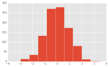
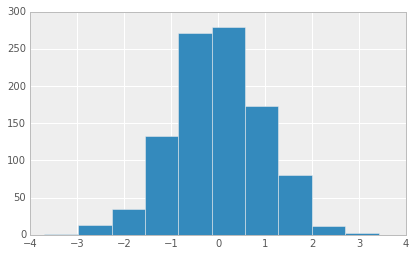
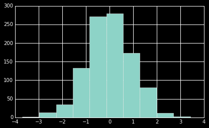
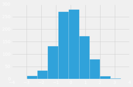
Matplotlib has style sheets you can use to make your plots look a little nicer. These style sheets include plot_bmh,plot_fivethirtyeight,plot_ggplot and more. They basically create a set of style rules that your plots follow. I recommend using them, they make all your plots have the same look and feel more professional. You can even create your own if you want your company's plots to all have the same look (it is a bit tedious to create on though).
Here is how to use them. Before plt.style.use() your plots look like this:df1['A'].hist()
|
|
Call the style:import matplotlib.pyplot as plt
plt.style.use('ggplot')
df1['A'].hist()
|
|||
plt.style.use('bmh')
df1['A'].hist()
|
|||
plt.style.use('dark_background')
df1['A'].hist()
|
|||
plt.style.use('fivethirtyeight')
df1['A'].hist()
|
|||
Plot Types |
There are several plot types built-in to pandas, most of them statistical plots by nature:
|
||
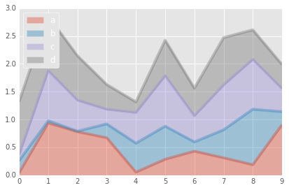
Area
|
df2.plot.area(alpha=0.4)
|
||
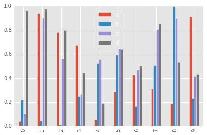
Barplots
|
df2.plot.bar()
|
||
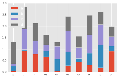
df2.plot.bar(stacked=True)
|
|||
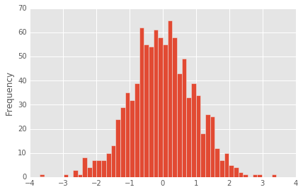
Histograms
|
df1['A'].plot.hist(bins=50)
|
||
Line Plots
|
df1.plot.line(x=df1.index,y='B',figsize=(12,3),lw=1)
| ||
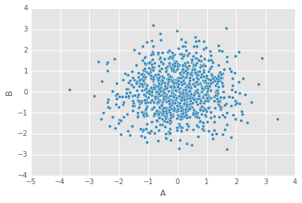
Scatter Plots
|
df1.plot.scatter(x='A',y='B')
|
||
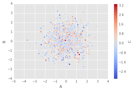
You can use c to color based off another column value Use cmap to indicate colormap to use. For all the colormaps, check out: http://matplotlib.org/users/colormaps.htmldf1.plot.scatter(x='A',y='B',c='C',cmap='coolwarm')
|
|||
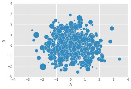
Or use s to indicate size based off another column. s parameter needs to be an array, not just the name of a column:df1.plot.scatter(x='A',y='B',s=df1['C']*200)
|
|||
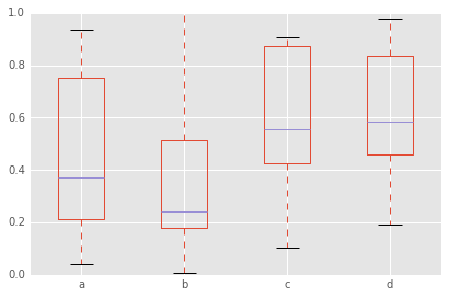
BoxPlots
|
df2.plot.box() # Can also pass a by= argument for groupby
|
||
Hexagonal Bin Plot
|
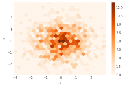
Useful for Bivariate Data, alternative to scatterplot:df = pd.DataFrame(np.random.randn(1000, 2), columns=['a', 'b'])
df.plot.hexbin(x='a',y='b',gridsize=25,cmap='Oranges')
|
||
Kernel Density Estimation plot (KDE)
|
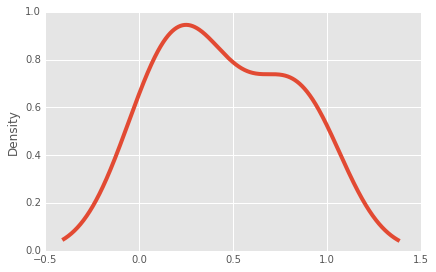
df2['a'].plot.kde()
|
||
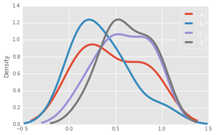
df2.plot.density()
|
|||
Data Visualization with Matplotlib
Matplotlib is the "grandfather" library of data visualization with Python. It was created by John Hunter. He created it to try to replicate MatLab's (another programming language) plotting capabilities in Python. So if you happen to be familiar with matlab, matplotlib will feel natural to you.
It is an excellent 2D and 3D graphics library for generating scientific figures.
ahora Some of the major Pros of Matplotlib are:
- Generally easy to get started for simple plots
- Support for custom labels and texts
- Great control of every element in a figure
- High-quality output in many formats
- Very customizable in general
References:
- The project web page for matplotlib: http://www.matplotlib.org
- The source code for matplotlib: https://github.com/matplotlib/matplotlib
- A large gallery showcaseing various types of plots matplotlib can create. Highly recommended!: http://matplotlib.org/gallery.html
- A good matplotlib tutorial: http://www.loria.fr/~rougier/teaching/matplotlib
But most likely you'll be passing numpy arrays or pandas columns (which essentially also behave like arrays). However, you can also use lists.
Matplotlib allows you to create reproducible figures programmatically. Let's learn how to use it! Before continuing this lecture, I encourage you just to explore the official Matplotlib web page: http://matplotlib.org/
Installation
conda install matplotlib
Or without conda:
pip install matplotlib
Importing:
import matplotlib.pyplot as plt
You'll also need to use this line to see plots in the notebook:
%matplotlib inline
That line is only for jupyter notebooks, if you are using another editor, you'll use: plt.show() at the end of all your plotting commands to have the figure pop up in another window.
Array example:import numpy as np
x = np.linspace(0, 5, 11)
y = x ** 2
x
# Output:
array([0. , 0.5, 1. , 1.5, 2. , 2.5, 3. , 3.5, 4. , 4.5, 5. ])
y
# Output:
array([ 0. , 0.25, 1. , 2.25, 4. , 6.25, 9. , 12.25, 16. ,
20.25, 25. ])
| |||
| Description/Example | Output/Figure | ||
|---|---|---|---|
Basic example |
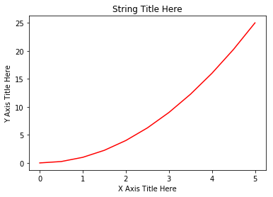
plt.plot(x, y, 'r') # 'r' is the color red
plt.xlabel('X Axis Title Here')
plt.ylabel('Y Axis Title Here')
plt.title('String Title Here')
plt.show()
|
||
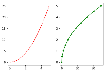
Creating Multiplots on Same Canvas |
# plt.subplot(nrows, ncols, plot_number)
plt.subplot(1,2,1)
plt.plot(x, y, 'r--') # More on color options later
plt.subplot(1,2,2)
plt.plot(y, x, 'g*-');
|
||
Matplotlib Object Oriented Method |
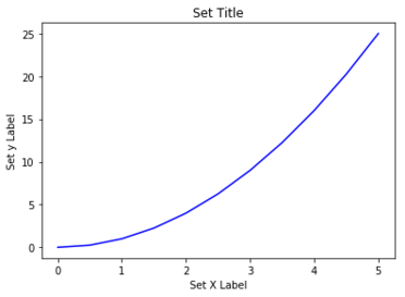
Now that we've seen the basics, let's break it all down with a more formal introduction of Matplotlib's Object Oriented API. This means we will instantiate figure objects and then call methods or attributes from that object.
The main idea in using the more formal Object Oriented method is to create figure objects and then just call methods or attributes off of that object. This approach is nicer when dealing with a canvas that has multiple plots on it. To begin we create a figure instance. Then we can add axes to that figure:# Create Figure (empty canvas)
fig = plt.figure()
# Add set of axes to figure
axes = fig.add_axes([0.1, 0.1, 0.8, 0.8]) # left, bottom, width, height (range 0 to 1)
# Plot on that set of axes
axes.plot(x, y, 'b')
axes.set_xlabel('Set X Label') # Notice the use of set_ to begin methods
axes.set_ylabel('Set y Label')
axes.set_title('Set Title')
|
||
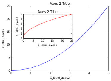
Code is a little more complicated, but the advantage is that we now have full control of where the plot axes are placed, and we can easily add more than one axis to the figure:# Creates blank canvas
fig = plt.figure()
axes1 = fig.add_axes([0.1, 0.1, 0.8, 0.8]) # main axes
axes2 = fig.add_axes([0.2, 0.5, 0.4, 0.3]) # inset axes
# Larger Figure Axes 1
axes1.plot(x, y, 'b')
axes1.set_xlabel('X_label_axes2')
axes1.set_ylabel('Y_label_axes2')
axes1.set_title('Axes 2 Title')
# Insert Figure Axes 2
axes2.plot(y, x, 'r')
axes2.set_xlabel('X_label_axes2')
axes2.set_ylabel('Y_label_axes2')
axes2.set_title('Axes 2 Title');
|
|||
|
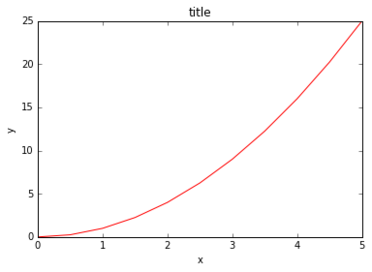
The plt.subplots() object will act as a more automatic axis manager:# Use similar to plt.figure() except use tuple unpacking to grab fig and axes
fig, axes = plt.subplots()
# Now use the axes object to add stuff to plot
axes.plot(x, y, 'r')
axes.set_xlabel('x')
axes.set_ylabel('y')
axes.set_title('title');
|
||
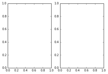
Then you can specify the number of rows and columns when creating the subplots() object:# Empty canvas of 1 by 2 subplots
fig, axes = plt.subplots(nrows=1, ncols=2)
|
|||
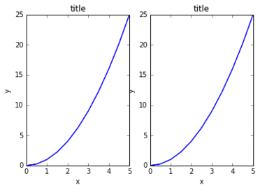
Axes is an array of axes to plot on:axes
# Output:
array([<matplotlib.axes._subplots.AxesSubplot object at 0x111f0f8d0>,
<matplotlib.axes._subplots.AxesSubplot object at 0x1121f5588>], dtype=object)
for ax in axes:
    ax.plot(x, y, 'b')
    ax.set_xlabel('x')
    ax.set_ylabel('y')
    ax.set_title('title')

# Display the figure object
fig
|
|||
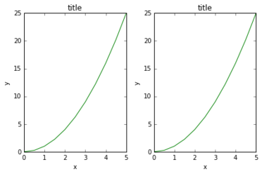
A common issue with matplolib is overlapping subplots or figures. We ca use fig.tight_layout() or plt.tight_layout() method, which automatically adjusts the positions of the axes on the figure canvas so that there is no overlapping content:fig, axes = plt.subplots(nrows=1, ncols=2)
for ax in axes:
ax.plot(x, y, 'g')
ax.set_xlabel('x')
ax.set_ylabel('y')
ax.set_title('title')
fig
plt.tight_layout()
|
|||
Figure size, aspect ratio and DPI |
Matplotlib allows the aspect ratio, DPI and figure size to be specified when the Figure object is created. You can use the figsize and dpi keyword arguments.
fig = plt.figure(figsize=(8,4), dpi=100)
# Output:
<Figure size 800x400 with 0 Axes>
|
||
The same arguments can also be passed to layout managers, such as the subplots function:fig, axes = plt.subplots(figsize=(12,3))
axes.plot(x, y, 'r')
axes.set_xlabel('x')
axes.set_ylabel('y')
axes.set_title('title');
|
|||
Saving figures |
Matplotlib can generate high-quality output in a number formats, including PNG, JPG, EPS, SVG, PGF and PDF.
savefig method in the Figure class:fig.savefig("filename.png")
fig.savefig("filename.png", dpi=200)
|
||
Legends, labels and titles |
Figure titles
A title can be added to each axis instance in a figure. To set the title, use the set_title method in the axes instance:ax.set_title("title");
|
||
Axis labels
Similarly, with the methods set_xlabel and set_ylabel, we can set the labels of the X and Y axes:ax.set_xlabel("x")
ax.set_ylabel("y");
|
|||
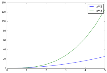
Legends
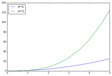
You can use the label="label text" keyword argument when plots or other objects are added to the figure, and then using the legend method without arguments to add the legend to the figure:fig = plt.figure()
ax = fig.add_axes([0,0,1,1])
ax.plot(x, x**2, label="x**2")
ax.plot(x, x**3, label="x**3")
ax.legend()
|
Notice how are legend overlaps some of the actual plot! | ||
The legend function takes an optional keyword argument loc that can be used to specify where in the figure the legend is to be drawn. The allowed values of loc are numerical codes for the various places the legend can be drawn. See the documentation page for details. Some of the most common loc values are:# Lots of options....
ax.legend(loc=1) # upper right corner
ax.legend(loc=2) # upper left corner
ax.legend(loc=3) # lower left corner
ax.legend(loc=4) # lower right corner
# .. many more options are available
# Most common to choose
ax.legend(loc=0) # let matplotlib decide the optimal location
fig
|
|||
Setting colors, linewidths, linetypes |
Colors with MatLab like syntax:
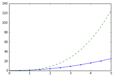
We can define the colors of lines and other graphical elements in a number of ways. First of all, we can use the MATLAB-like syntax where 'b' means blue, 'g' means green, etc. The MATLAB API for selecting line styles are also supported: where, for example, 'b.-' means a blue line with dots:# MATLAB style line color and style
fig, ax = plt.subplots()
ax.plot(x, x**2, 'b.-') # blue line with dots
ax.plot(x, x**3, 'g--') # green dashed line
|
||
Colors with the color= parameter:
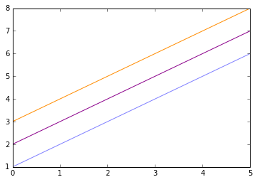
We can also define colors by their names or RGB hex codes and optionally provide an alpha value using the color and alpha keyword arguments. Alpha indicates opacity.fig, ax = plt.subplots()
ax.plot(x, x+1, color="blue", alpha=0.5) # half-transparant
ax.plot(x, x+2, color="#8B008B") # RGB hex code
ax.plot(x, x+3, color="#FF8C00") # RGB hex code
|
|||
Line and marker styles:
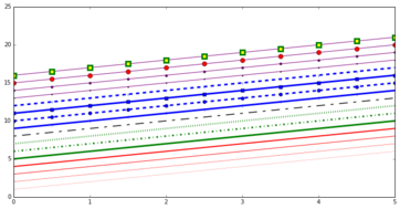
To change the line width, we can use the linewidth or lw keyword argument. The line style can be selected using the linestyle or ls keyword arguments:fig, ax = plt.subplots(figsize=(12,6))
ax.plot(x, x+1, color="red", linewidth=0.25)
ax.plot(x, x+2, color="red", linewidth=0.50)
ax.plot(x, x+3, color="red", linewidth=1.00)
ax.plot(x, x+4, color="red", linewidth=2.00)
# possible linestype options ‘-‘, ‘–’, ‘-.’, ‘:’, ‘steps’
ax.plot(x, x+5, color="green", lw=3, linestyle='-')
ax.plot(x, x+6, color="green", lw=3, ls='-.')
ax.plot(x, x+7, color="green", lw=3, ls=':')
# custom dash
line, = ax.plot(x, x+8, color="black", lw=1.50)
line.set_dashes([5, 10, 15, 10]) # format: line length, space length, ...
# possible marker symbols: marker = '+', 'o', '*', 's', ',', '.', '1', '2', '3', '4', ...
ax.plot(x, x+ 9, color="blue", lw=3, ls='-', marker='+')
ax.plot(x, x+10, color="blue", lw=3, ls='--', marker='o')
ax.plot(x, x+11, color="blue", lw=3, ls='-', marker='s')
ax.plot(x, x+12, color="blue", lw=3, ls='--', marker='1')
# marker size and color
ax.plot(x, x+13, color="purple", lw=1, ls='-', marker='o', markersize=2)
ax.plot(x, x+14, color="purple", lw=1, ls='-', marker='o', markersize=4)
ax.plot(x, x+15, color="purple", lw=1, ls='-', marker='o', markersize=8, markerfacecolor="red")
ax.plot(x, x+16, color="purple", lw=1, ls='-', marker='s', markersize=8,
markerfacecolor="yellow", markeredgewidth=3, markeredgecolor="green");
|
|||
Plot range |
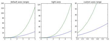
We can configure the ranges of the axes using the set_ylim and set_xlim methods in the axis object, or axis('tight') for automatically getting "tightly fitted" axes ranges:fig, axes = plt.subplots(1, 3, figsize=(12, 4))
axes[0].plot(x, x**2, x, x**3)
axes[0].set_title("default axes ranges")
axes[1].plot(x, x**2, x, x**3)
axes[1].axis('tight')
axes[1].set_title("tight axes")
axes[2].plot(x, x**2, x, x**3)
axes[2].set_ylim([0, 60])
axes[2].set_xlim([2, 5])
axes[2].set_title("custom axes range");
|
||
Special Plot Types |
There are many specialized plots we can create, such as barplots, histograms, scatter plots, and much more. Most of these type of plots we will actually create using seaborn, a statistical plotting library for Python. But here are a few examples of these type of plots: | ||
Scatter plots |
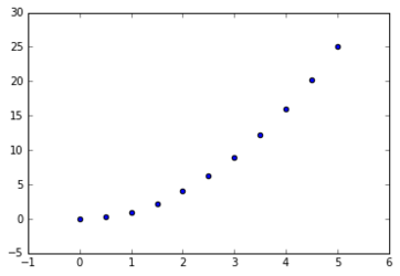
plt.scatter(x,y)
|
||
Histograms |
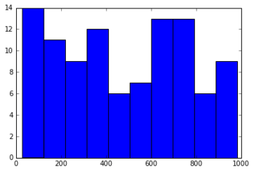
from random import sample
data = sample(range(1, 1000), 100)
plt.hist(data)
|
||
Barplots |
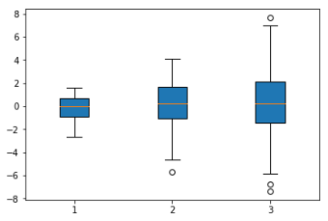
data = [np.random.normal(0, std, 100) for std in range(1, 4)]

# rectangular box plot
plt.boxplot(data,vert=True,patch_artist=True);
|
||
Advanced Matplotlib Concepts
In this lecture we cover some more advanced topics which you won't usually use as often. You can always reference the documentation for more resources!
Forther reading:
import numpy as np
x = np.linspace(0, 5, 11)
y = x ** 2
| |||
| Description/Example | Output/Figure | ||
|---|---|---|---|
Logarithmec scale |
|||
Placement of ticks and custom tick labels |
|||
Scientific notation |
|||
Axis number and axis label spacing |
|||
Axis position adjustments |
|||
Axis grid |
|||
Axis spines |
|||
Twin axes |
|||
Axes where x and y is zero |
|||
Other 2D plot styles |
|||
Text annotation |
|||
Figures with multiple subplots and insets |
|||
subplots |
|||
subplot2grid |
|||
gridspec |
|||
add_axes |
|||
Colormap and contour figures |
|||
pcolor |
|||
imshow |
|||
contour |
|||
3D figures |
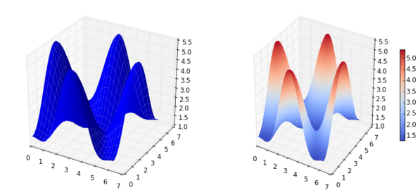
To use 3D graphics in matplotlib, we first need to create an instance of the Axes3D class. 3D axes can be added to a matplotlib figure canvas in exactly the same way as 2D axes; or, more conveniently, by passing a projection='3d' keyword argument to the add_axes or add_subplot methods.from mpl_toolkits.mplot3d.axes3d import Axes3D
| ||
Surface plots |
fig = plt.figure(figsize=(14,6))

# `ax` is a 3D-aware axis instance because of the projection='3d' keyword argument to add_subplot
ax = fig.add_subplot(1, 2, 1, projection='3d')

p = ax.plot_surface(X, Y, Z, rstride=4, cstride=4, linewidth=0)

# surface_plot with color grading and color bar
ax = fig.add_subplot(1, 2, 2, projection='3d')
p = ax.plot_surface(X, Y, Z, rstride=1, cstride=1, cmap=matplotlib.cm.coolwarm, linewidth=0, antialiased=False)
cb = fig.colorbar(p, shrink=0.5)
| ||
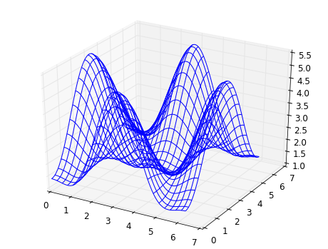
Wire-frame plot |
fig = plt.figure(figsize=(8,6))
ax = fig.add_subplot(1, 1, 1, projection='3d')
p = ax.plot_wireframe(X, Y, Z, rstride=4, cstride=4)
|
||
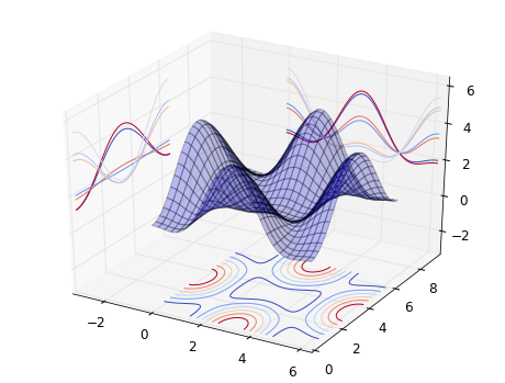
Coutour plots with projections |
fig = plt.figure(figsize=(8,6))

ax = fig.add_subplot(1,1,1, projection='3d')

ax.plot_surface(X, Y, Z, rstride=4, cstride=4, alpha=0.25)
cset = ax.contour(X, Y, Z, zdir='z', offset=-np.pi, cmap=matplotlib.cm.coolwarm)
cset = ax.contour(X, Y, Z, zdir='x', offset=-np.pi, cmap=matplotlib.cm.coolwarm)
cset = ax.contour(X, Y, Z, zdir='y', offset=3*np.pi, cmap=matplotlib.cm.coolwarm)

ax.set_xlim3d(-np.pi, 2*np.pi);
ax.set_ylim3d(0, 3*np.pi);
ax.set_zlim3d(-np.pi, 2*np.pi);
|
||
Data visualization with Seaborn
Seaborn is a statistical visualization library designed to work with pandas dataframes well.
import seaborn as sns
%matplotlib inline
Built-in data sets
Seaborn comes with built-in data sets!
tips = sns.load_dataset('tips')
tips.head()
# Output:
    total_bill    tip     sex  smoker   day    time  size
0        16.99   1.01  Female      No   Sun  Dinner     2
1        10.34   1.66    Male      No   Sun  Dinner     3
2        21.01   3.50    Male      No   Sun  Dinner     3
3        23.68   3.31    Male      No   Sun  Dinner     2
4        24.59   3.61  Female      No   Sun  Dinner     4
Distribution Plots
import seaborn as sns
%matplotlib inline
| |||||
| Description/Example | Output/Figure | ||||
|---|---|---|---|---|---|
Distribution of a univariate set of observations |
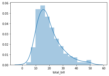
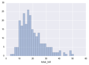
distplot
|
The distplot shows the distribution of a univariate set of observations:sns.distplot(tips['total_bill'])
# Safe to ignore warnings
sns.distplot(tips['total_bill'],kde=False,bins=30)
|
|||
Match up two distplots for bivariate data |
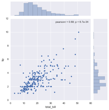
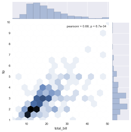
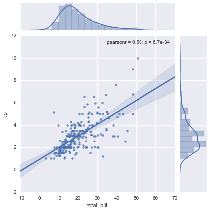
jointplot()
|
jointplot() allows you to basically match up two distplots for bivariate data. With your choice of what kind parameter to compare with:
sns.jointplot(x='total_bill',y='tip',data=tips,kind='scatter')
sns.jointplot(x='total_bill',y='tip',data=tips,kind='hex')
sns.jointplot(x='total_bill',y='tip',data=tips,kind='reg')
|
|||
Plot pairwise relationships across an entire dataframe |
pairplot
|
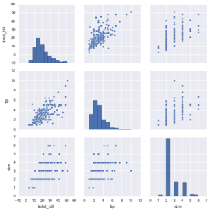
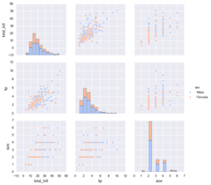
pairplot will plot pairwise relationships across an entire dataframe (for the numerical columns) and supports a color hue argument (for categorical columns):sns.pairplot(tips)
sns.pairplot(tips,hue='sex',palette='coolwarm')
| |||
Draw a dash mark for every point on a univariate distribution |
rugplot
|
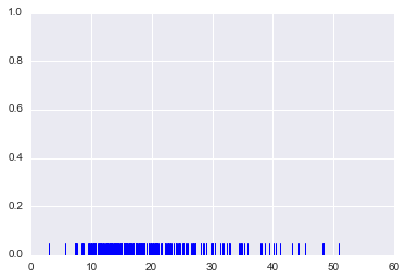
rugplots are actually a very simple concept, they just draw a dash mark for every point on a univariate distribution. They are the building block of a KDE plot:sns.rugplot(tips['total_bill'])
|
|||
Kernel Density Estimation plots |
kdeplot
|
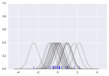
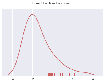
kdeplots are Kernel Density Estimation plots. These KDE plots replace every single observation with a Gaussian (Normal) distribution centered around that value. For example:# Don't worry about understanding this code!
# It's just for the diagram below
import numpy as np
import matplotlib.pyplot as plt
from scipy import stats
#Create dataset
dataset = np.random.randn(25)
# Create another rugplot
sns.rugplot(dataset);
# Set up the x-axis for the plot
x_min = dataset.min() - 2
x_max = dataset.max() + 2
# 100 equally spaced points from x_min to x_max
x_axis = np.linspace(x_min,x_max,100)
# Set up the bandwidth, for info on this:
url = 'http://en.wikipedia.org/wiki/Kernel_density_estimation#Practical_estimation_of_the_bandwidth'
bandwidth = ((4*dataset.std()**5)/(3*len(dataset)))**.2
# Create an empty kernel list
kernel_list = []
# Plot each basis function
for data_point in dataset:
# Create a kernel for each point and append to list
kernel = stats.norm(data_point,bandwidth).pdf(x_axis)
kernel_list.append(kernel)
#Scale for plotting
kernel = kernel / kernel.max()
kernel = kernel * .4
plt.plot(x_axis,kernel,color = 'grey',alpha=0.5)
plt.ylim(0,1)
|
|||
# To get the kde plot we can sum these basis functions.

# Plot the sum of the basis function
sum_of_kde = np.sum(kernel_list,axis=0)

# Plot figure
fig = plt.plot(x_axis,sum_of_kde,color='indianred')

# Add the initial rugplot
sns.rugplot(dataset,c = 'indianred')

# Get rid of y-tick marks
plt.yticks([])

# Set title
plt.suptitle("Sum of the Basis Functions")
|
|||||
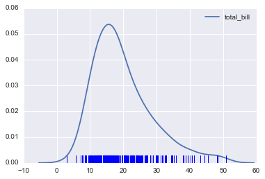
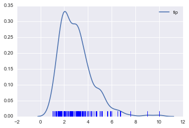
So with our tips dataset:sns.kdeplot(tips['total_bill'])
sns.rugplot(tips['total_bill'])
|
|||||
sns.kdeplot(tips['tip'])
sns.rugplot(tips['tip'])
|
|||||
Categorical Data Plots
Now let's discuss using seaborn to plot categorical data! There are a few main plot types for this:
factorplotboxplotviolinplotstripplotswarmplotbarplotcountplot
import seaborn as sns
%matplotlib inline
| |||
| Description/Example | Output/Figure | ||
|---|---|---|---|
Barplot and Countplot |
sns.barplot
|
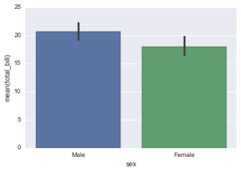
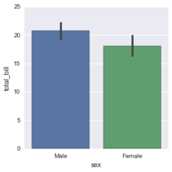
barplot is a general plot that allows you to aggregate the categorical data based off some function, by default the mean:sns.barplot(x='sex',y='total_bill',data=tips)
|
|
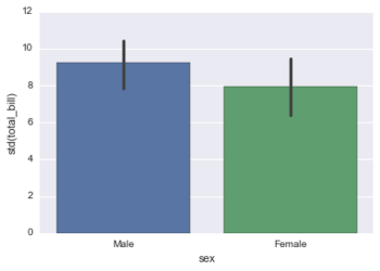
You can change the estimator object to your own function, that converts a vector to a scalar:import numpy as np
sns.barplot(x='sex',y='total_bill',data=tips,estimator=np.std)
|
|||
sns.countplot
|
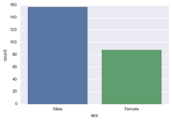
This is essentially the same as barplot except the estimator is explicitly counting the number of occurrences. Which is why we only pass the x value:sns.countplot(x='sex',data=tips)
|
||
Boxplot and Violinplot |
Boxplots and Violinplots are used to shown the distribution of categorical data. | ||
sns.boxplot
|
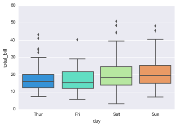
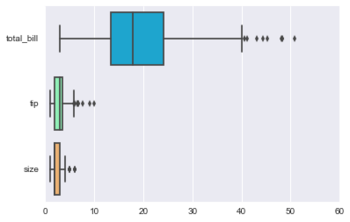
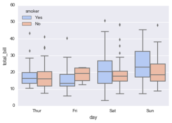
A box plot (or box-and-whisker plot) shows the distribution of quantitative data in a way that facilitates comparisons between variables or across levels of a categorical variable. The box shows the quartiles of the dataset while the whiskers extend to show the rest of the distribution, except for points that are determined to be “outliers” using a method that is a function of the inter-quartile range.sns.boxplot(x="day", y="total_bill", data=tips,palette='rainbow')
# Can do entire dataframe with orient='h'
sns.boxplot(data=tips,palette='rainbow',orient='h')
sns.boxplot(x="day", y="total_bill", hue="smoker",data=tips, palette="coolwarm")
|
||
sns.violinplot
|
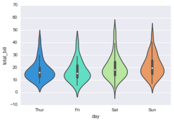
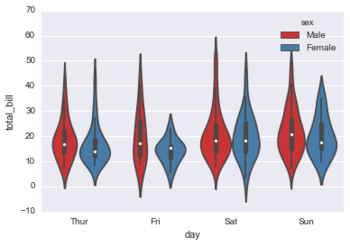
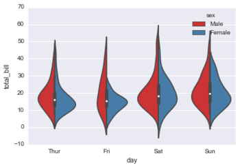
A violin plot plays a similar role as a box and whisker plot. It shows the distribution of quantitative data across several levels of one (or more) categorical variables such that those distributions can be compared. Unlike a box plot, in which all of the plot components correspond to actual datapoints, the violin plot features a kernel density estimation of the underlying distribution.sns.violinplot(x="day", y="total_bill", data=tips,palette='rainbow')
sns.violinplot(x="day", y="total_bill", data=tips,hue='sex',palette='Set1')
sns.violinplot(x="day", y="total_bill", data=tips,hue='sex',split=True,palette='Set1')
|
||
Stripplot and Swarmplot |
sns.stripplot
|
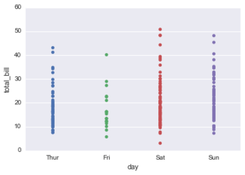
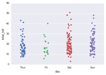
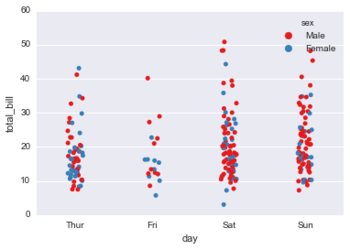
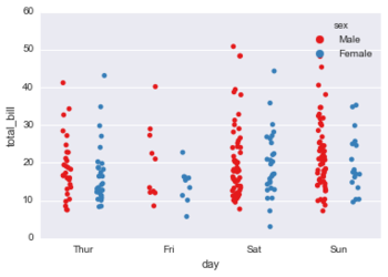
The stripplot will draw a scatterplot where one variable is categorical. A strip plot can be drawn on its own, but it is also a good complement to a box or violin plot in cases where you want to show all observations along with some representation of the underlying distribution.sns.stripplot(x="day", y="total_bill", data=tips)
sns.stripplot(x="day", y="total_bill", data=tips,jitter=True)
sns.stripplot(x="day", y="total_bill", data=tips,jitter=True,hue='sex',palette='Set1')
sns.stripplot(x="day", y="total_bill", data=tips,jitter=True,hue='sex',palette='Set1',split=True)
|
|
sns.swarmplot
|
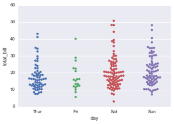
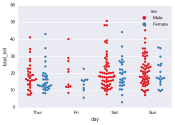
The swarmplot is similar to stripplot(), but the points are adjusted (only along the categorical axis) so that they don’t overlap. This gives a better representation of the distribution of values, although it does not scale as well to large numbers of observations (both in terms of the ability to show all the points and in terms of the computation needed to arrange them).sns.swarmplot(x="day", y="total_bill", data=tips)
sns.swarmplot(x="day", y="total_bill",hue='sex',data=tips, palette="Set1", split=True)
|
||
Combining Categorical Plots |
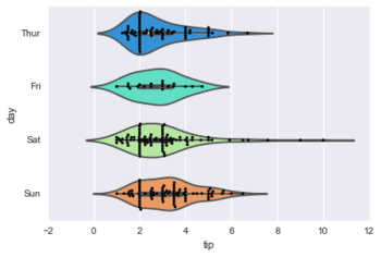
sns.violinplot(x="tip", y="day", data=tips,palette='rainbow')
sns.swarmplot(x="tip", y="day", data=tips,color='black',size=3)
|
||
Factorplot |
sns.factorplot
|
factorplot is the most general form of a categorical plot. It can take in a kind parameter to adjust the plot type:<syntaxhighlight lang="python3">sns.factorplot(x='sex',y='total_bill',data=tips,kind='bar')
|
|
Matrix Plots
Matrix plots allow you to plot data as color-encoded matrices and can also be used to indicate clusters within the data (later in the machine learning section we will learn how to formally cluster data).
import seaborn as sns
%matplotlib inline

flights = sns.load_dataset('flights')

tips = sns.load_dataset('tips')

tips.head()
# Output:
    total_bill    tip     sex  smoker   day    time  size
0        16.99   1.01  Female      No   Sun  Dinner     2
1        10.34   1.66    Male      No   Sun  Dinner     3
2        21.01   3.50    Male      No   Sun  Dinner     3
3        23.68   3.31    Male      No   Sun  Dinner     2
4        24.59   3.61  Female      No   Sun  Dinner     4

flights.head()
# Output:
    year       month    passengers
0   1949     January          112
1   1949    February          118
2   1949       March          132
3   1949       April          129
4   1949         May          121
| |||
| Description/Example | Output/Figure | ||
|---|---|---|---|
Heatmap |
sns.heatmap
|
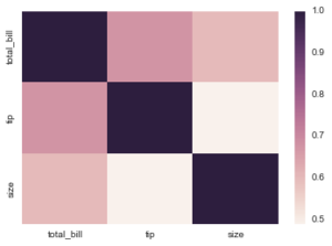
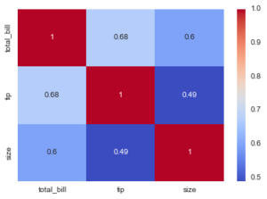
In order for a heatmap to work properly, your data should already be in a matrix form, the sns.heatmap function basically just colors it in for you. For example:# Matrix form for correlation data
tips.corr()
# Output:
total_bill tip size
total_bill 1.000000 0.675734 0.598315
tip 0.675734 1.000000 0.489299
size 0.598315 0.489299 1.000000
sns.heatmap(tips.corr())
sns.heatmap(tips.corr(),cmap='coolwarm',annot=True)
|
|
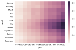
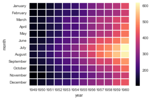
Or for the flights data:flights.pivot_table(values='passengers',index='month',columns='year')
# Output:
year 1949 1950 1951 1952 1953 1954 1955 1956 1957 1958 1959 1960
month
January 112 115 145 171 196 204 242 284 315 340 360 417
February 118 126 150 180 196 188 233 277 301 318 342 391
March 132 141 178 193 236 235 267 317 356 362 406 419
April 129 135 163 181 235 227 269 313 348 348 396 461
May 121 125 172 183 229 234 270 318 355 363 420 472
June 135 149 178 218 243 264 315 374 422 435 472 535
July 148 170 199 230 264 302 364 413 465 491 548 622
August 148 170 199 242 272 293 347 405 467 505 559 606
September 136 158 184 209 237 259 312 355 404 404 463 508
October 119 133 162 191 211 229 274 306 347 359 407 461
November 104 114 146 172 180 203 237 271 305 310 362 390
December 118 140 166 194 201 229 278 306 336 337 405 432
pvflights = flights.pivot_table(values='passengers',index='month',columns='year')
sns.heatmap(pvflights)
sns.heatmap(pvflights,cmap='magma',linecolor='white',linewidths=1)
|
|||
Clustermap |
sns.clustermap
|
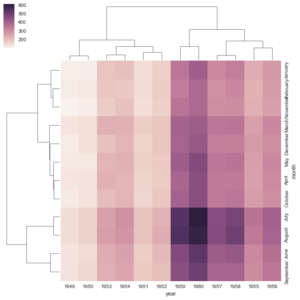
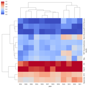
The clustermap uses hierarchal clustering to produce a clustered version of the heatmap. For example:sns.clustermap(pvflights)
# More options to get the information a little clearer like normalization
sns.clustermap(pvflights,cmap='coolwarm',standard_scale=1)
|
|
Grids
Grids are general types of plots that allow you to map plot types to rows and columns of a grid, this helps you create similar plots separated by features.
import seaborn as sns
import matplotlib.pyplot as plt
%matplotlib inline

iris = sns.load_dataset('iris')
iris.head()
# Ouput:
    sepal_length    sepal_width    petal_length   petal_width    species
0            5.1            3.5            1.4            0.2     setosa
1            4.9            3.0            1.4            0.2     setosa
2            4.7            3.2            1.3            0.2     setosa
3            4.6            3.1            1.5            0.2     setosa
4            5.0            3.6            1.4            0.2     setosa
| |||
| Description/Example | Output/Figure | ||
|---|---|---|---|
PairGrid |
sns.PairGrid()
|
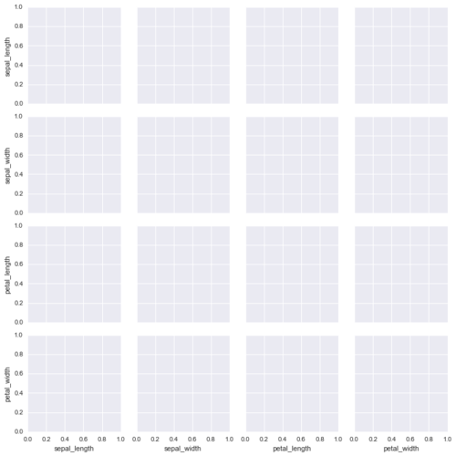
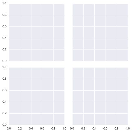
Pairgrid is a subplot grid for plotting pairwise relationships in a dataset.# Just the Grid
sns.PairGrid(iris)
|
|
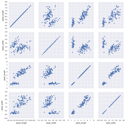
Then you map to the gridg = sns.PairGrid(iris)
g.map(plt.scatter)
|
|||
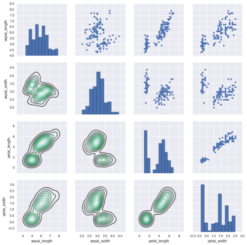
Map to upper,lower, and diagonalg = sns.PairGrid(iris)
g.map_diag(plt.hist)
g.map_upper(plt.scatter)
g.map_lower(sns.kdeplot)
|
|||
Pairplot |
sns.pairplot()
|
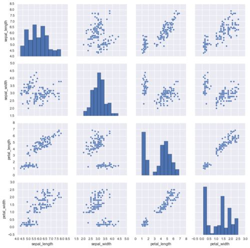
A pairplot is a simpler version of PairGrid (you'll use quite often)sns.pairplot(iris)
|
|
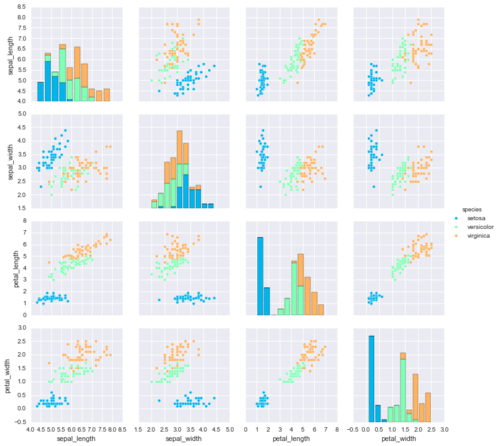
sns.pairplot(iris,hue='species',palette='rainbow')
|
|||
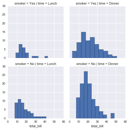
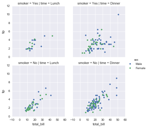
Facet Grid |
FacetGrid is the general way to create grids of plots based off of a feature:tips = sns.load_dataset('tips')
# tips.head()
total_bill tip sex smoker day time size
0 16.99 1.01 Female No Sun Dinner 2
1 10.34 1.66 Male No Sun Dinner 3
2 21.01 3.50 Male No Sun Dinner 3
3 23.68 3.31 Male No Sun Dinner 2
4 24.59 3.61 Female No Sun Dinner 4
|
||
sns.FacetGrid()
|
# Just the Grid
g = sns.FacetGrid(tips, col="time", row="smoker")
|
||
g = sns.FacetGrid(tips, col="time",  row="smoker")
g = g.map(plt.hist, "total_bill")
|
|||
g = sns.FacetGrid(tips, col="time",  row="smoker",hue='sex')
# Notice hwo the arguments come after plt.scatter call
g = g.map(plt.scatter, "total_bill", "tip").add_legend()
|
|||
JointGri |
sns.JointGrid()
|
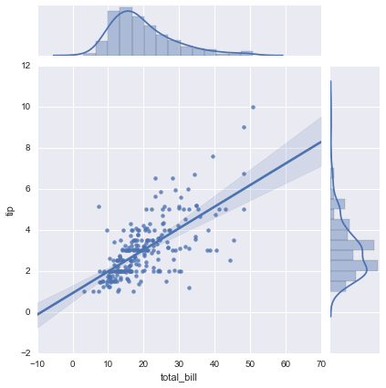
JointGrid is the general version for jointplot() type grids, for a quick example:g = sns.JointGrid(x="total_bill", y="tip", data=tips)
|
|
g = sns.JointGrid(x="total_bill", y="tip", data=tips)
g = g.plot(sns.regplot, sns.distplot)
|
|||
Regression plots
Seaborn has many built-in capabilities for regression plots, however we won't really discuss regression until the machine learning section of the course, so we will only cover the lmplot() function for now.
lmplot allows you to display linear models, but it also conveniently allows you to split up those plots based off of features, as well as coloring the hue based off of features.
import seaborn as sns
%matplotlib inline

tips = sns.load_dataset('tips')

tips.head()
# Output:
    total_bill    tip     sex  smoker   day    time  size
0        16.99   1.01  Female      No   Sun  Dinner     2
1        10.34   1.66    Male      No   Sun  Dinner     3
2        21.01   3.50    Male      No   Sun  Dinner     3
3        23.68   3.31    Male      No   Sun  Dinner     2
4        24.59   3.61  Female      No   Sun  Dinner     4
| |||
| Description/Example | Output/Figure | ||
|---|---|---|---|
The lmplot() function |
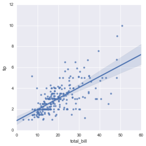
sns.lmplot(x='total_bill',y='tip',data=tips)
|
||
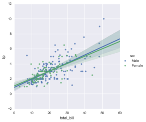
sns.lmplot(x='total_bill',y='tip',data=tips,hue='sex')
|
|||
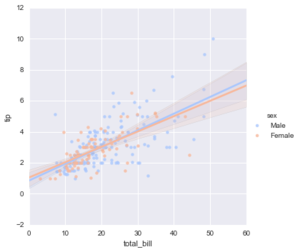
sns.lmplot(x='total_bill',y='tip',data=tips,hue='sex',palette='coolwarm')
|
|||
Working with Markers |
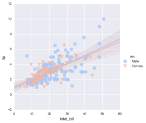
lmplot kwargs get passed through to regplot which is a more general form of lmplot(). regplot has a scatter_kws parameter that gets passed to plt.scatter. So you want to set the s parameter in that dictionary, which corresponds (a bit confusingly) to the squared markersize. In other words you end up passing a dictionary with the base matplotlib arguments, in this case, s for size of a scatter plot. In general, you probably won't remember this off the top of your head, but instead reference the documentation.# http://matplotlib.org/api/markers_api.html
sns.lmplot(x='total_bill',y='tip',data=tips,hue='sex',palette='coolwarm',
markers=['o','v'],scatter_kws={'s':100})
|
||
Using a Grid |
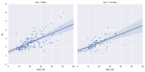
We can add more variable separation through columns and rows with the use of a grid. Just indicate this with the col or row arguments:sns.lmplot(x='total_bill',y='tip',data=tips,col='sex')
|
||
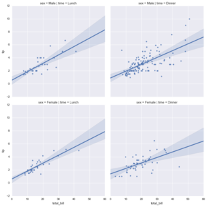
sns.lmplot(x="total_bill", y="tip", row="sex", col="time",data=tips)
|
|||
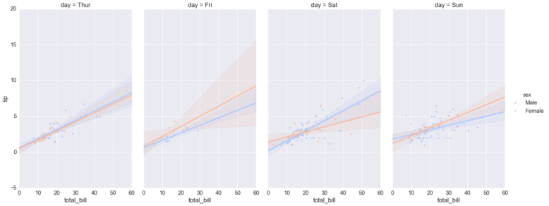
sns.lmplot(x='total_bill',y='tip',data=tips,col='day',hue='sex',palette='coolwarm')
| |||
Aspect and Size |
Seaborn figures can have their size and aspect ratio adjusted with the size and aspect parameters:sns.lmplot(x='total_bill',y='tip',data=tips,col='day',hue='sex',palette='coolwarm',
aspect=0.6,size=8)
| ||
Style and Color
Check out the documentation page for more info on these topics: https://stanford.edu/~mwaskom/software/seaborn/tutorial/aesthetics.html
import seaborn as sns
import matplotlib.pyplot as plt
%matplotlib inline
tips = sns.load_dataset('tips')
| |||
| Method/Operator | Description/Example | Output/Figure | |
|---|---|---|---|
Styles |
sns.set_style()
|
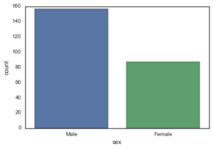
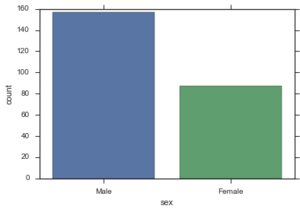
sns.countplot(x='sex',data=tips)
|
|
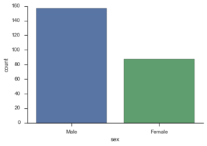
You can set particular styles:sns.set_style('white')
sns.countplot(x='sex',data=tips)
|
|||
sns.set_style('ticks')
sns.countplot(x='sex',data=tips,palette='deep')
|
|||
Spine Removal |
sns.despine()
|
sns.countplot(x='sex',data=tips)
sns.despine()
|
|
sns.countplot(x='sex',data=tips)
sns.despine(left=True)
|
|||
Size and Aspect |
Size
|
You can use matplotlib's plt.figure(figsize=(width,height to change the size of most seaborn plots.
You can control the size and aspect ratio of most seaborn grid plots by passing in parameters: size, and aspect. For example:# Non Grid Plot
plt.figure(figsize=(12,3))
sns.countplot(x='sex',data=tips)
|
|
Grid Type |
# Grid Type Plot
sns.lmplot(x='total_bill',y='tip',size=2,aspect=4,data=tips)
|
||
Scale and Context |
set_context()
|
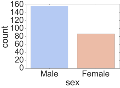
The set_context() allows you to override default parameters:sns.set_context('poster',font_scale=4)
sns.countplot(x='sex',data=tips,palette='coolwarm')
|
|
Plotly and Cufflinks Data Visualization
Plotly is a library that allows you to create interactive plots that you can use in dashboards or websites (you can save them as html files or static images).
Check out the plotly.py documentation and gallery to learn more: https://plot.ly/python/
Plotly plots can be easily saved online and shared at https://chart-studio.plot.ly. Take a look at this example: https://chart-studio.plot.ly/~jackp/671/average-effective-tax-rates-by-income-percentiles-1960-2004/#/
Installation
In order for this all to work, you'll need to install plotly and cufflinks to call plots directly off of a pandas dataframe. Cufflinks is not currently available through conda but available through pip. Install the libraries at your command line/terminal using:
pip install plotly
pip install cufflinks
Imports and Set-up
import pandas as pd
import numpy as np
%matplotlib inline

from plotly import __version__
from plotly.offline import download_plotlyjs, init_notebook_mode, plot, iplot
print(__version__) # requires version >= 1.9.0

import cufflinks as cf

# For Notebooks
init_notebook_mode(connected=True)

# For offline use
cf.go_offline()
Data
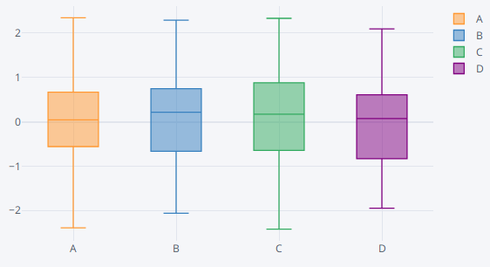
df = pd.DataFrame(np.random.randn(100,4),columns='A B C D'.split())
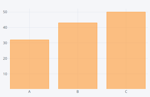
df2 = pd.DataFrame({'Category':['A','B','C'],'Values':[32,43,50]})

df.head()
# Output:
           A           B           C           D
0   1.878725    0.688719    1.066733    0.543956
1   0.028734    0.104054    0.048176    1.842188
2  -0.158793    0.387926   -0.635371   -0.637558
3  -1.221972    1.393423   -0.299794   -1.113622
4   1.253152   -0.537598    0.302917   -2.546083

df2.head()
# Output:
    Category   Values
0          A       32
1          B       43
2          C       50
| Method/Operator | Description/Example | Output/Figure | |
|---|---|---|---|
Using Cufflinks and iplot() |
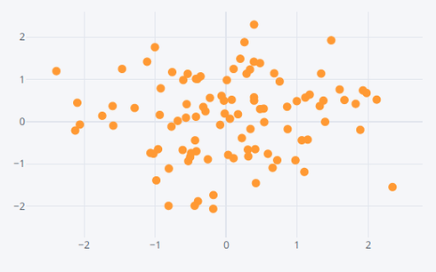
Scatter | df.iplot(kind='scatter',x='A',y='B',mode='markers',size=10)
|
https://plot.ly/~adeloaleman/15 |
Bar Plots |
df2.iplot(kind='bar',x='Category',y='Values')
|
https://plot.ly/~adeloaleman/13 | |
Boxplots |
df.iplot(kind='box')
|
https://plot.ly/~adeloaleman/11 | |
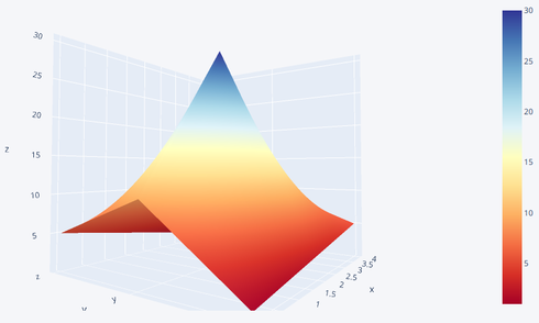
3d Surface |
df3 = pd.DataFrame({'x':[1,2,3,4,5],'y':[10,20,30,20,10],'z':[5,4,3,2,1]})
df3.iplot(kind='surface',colorscale='rdylbu')
|
https://plot.ly/~adeloaleman/17 | |
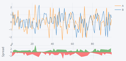
Spread |
df[['A','B']].iplot(kind='spread')
|
https://plot.ly/~adeloaleman/19 | |
Histogram |
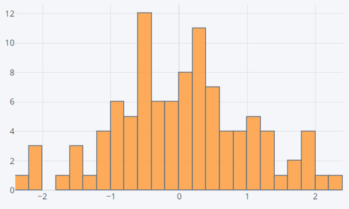
df['A'].iplot(kind='hist',bins=25)
|
https://plot.ly/~adeloaleman/21 | |
Bubble |
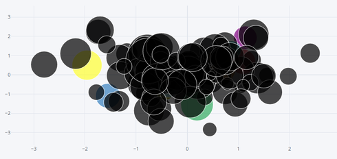
df.iplot(kind='bubble',x='A',y='B',size='C')
|
https://plot.ly/~adeloaleman/23 | |
Scatter_matrix |
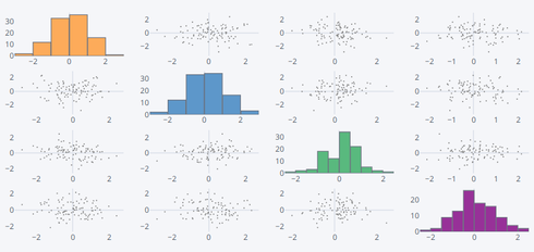
df.scatter_matrix()

# Similar to sns.pairplot()
|
https://plot.ly/~adeloaleman/25 |
Word cloud
https://github.com/amueller/word_cloud
In Dash:
Installation
Using pip:
pip install wordcloud
Using conda:
https://anaconda.org/conda-forge/wordcloud
conda install -c conda-forge wordcloud
Installation notes:
wordcloud depends on numpy and pillow.
To save the wordcloud into a file, matplotlib can also be installed.
Minimal example
Can be run in jupyter-notebook:
"""
Minimal Example
===============
Generating a square wordcloud from the US constitution using default arguments.
"""

import os

from os import path
from wordcloud import WordCloud

# get data directory (using getcwd() is needed to support running example in generated IPython notebook)
d = path.dirname(__file__) if "__file__" in locals() else os.getcwd()

# Read the whole text.
text = open(path.join(d, 'constitution.txt')).read()

# Generate a word cloud image
wordcloud = WordCloud().generate(text)

# Display the generated image:
# the matplotlib way:
import matplotlib.pyplot as plt
plt.imshow(wordcloud, interpolation='bilinear')
plt.axis("off")

# lower max_font_size
wordcloud = WordCloud(max_font_size=40).generate(text)
plt.figure()
plt.imshow(wordcloud, interpolation="bilinear")
plt.axis("off")
plt.show()

# The pil way (if you don't have matplotlib)
# image = wordcloud.to_image()
# image.show()
